
In the old days --- a year or so ago --- home-buyers were looking for “the most house for the money.” They only had so many dollars to work with. And, when they did the math, they often found themselves out on the far edge of suburbia.
It was easier and cheaper for developers to put up houses on wide open farm fields, and they passed along a lot of those savings to their customers.
Hence, the mantra: “Drive until you qualify.” A young couple or family could qualify for a mortgage for the lower priced homes that were spreading out along the region’s fringe.
Hence, sprawl.
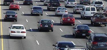
 Yet, there was a not-so-hidden cost in those lower-priced homes --- transportation. Anyone moving farther out knew that they’d have to drive more. But what’s a few extra minutes? Or an extra half hour?
How about a lot of extra dollars? That’s the cost that was often overlooked. For one thing, it was difficult to quantify. The purchase price and the mortgage payment for a new house are clear-cut numbers, but how much does all that additional driving and lack of access to public transportation mean to a household budget?
New tools
New tools, though, are becoming available to help potential homebuyers do some of these calculations. The goal is to help them achieve something called location efficiency.
“We want to educate the consumers and the policy-makers of what it means when you ‘drive till you qualify.’ We’re talking about a new definition of affordable housing,” says Nicole Gotthelf, director of development and communications for the Chicago-based Center for Neighborhood Technology (CNT).
A location can be more or less efficient. If you need a lot of time and driving to get things done, the location is inefficient. By contrast, Gotthelf says, “When you have compact neighborhoods, you have more transportation efficiency, and you save more money.”
Here’s where the new tools come in.
Let’s say you live in the Chicago metropolitan region, and you’re looking to buy a home. (Let’s pretend that the economic stranglehold has eased --- as it will, eventually.) And let’s say you live in Oak Park, and you’re looking at homes out west of Aurora.
Well, you can go to the CNT website, and use two maps comparing the housing costs and the housing and transportation costs (the H+T Affordability Index) for places throughout the region. In both, you can look at the region as a whole, and also burrow down all the way to the block level.
In the map on the left, you’re able to see that housing costs are pretty good in that area because they’re colored yellow, indicating that they represent less than 30 percent of the region’s median household income.
But the housing-transportation map on the right shows a lot of that area west of Aurora in blue, meaning that those two costs represent 45 percent or more of the median household income.
These maps are a step in the right direction in terms of giving homebuyers some sense of the tradeoffs that come with locations, and CNT expects to have similar sites available by mid-summer for more than 300 metropolitan regions in the U.S.
But they’re only a first step.
An even better tool
If you want to see how really detailed --- how really helpful --- these calculations can get, go to the Urban Land Institute’s Housing + Transportation Calculator site which covers the Washington, D.C. metro region.
Here, you can plug in your personal information (such as home address, work address, income, number of cars, public transit use) and then, by inputting other addresses, see how your housing and transportation costs would change if you moved to those places.
For instance, if you live on Faraday Place in Washington, and make about $110,000 a year, and you’re considering a move to Brethour Court in Sterling, Va., about 27 miles outside the city, the calculator shows you that your transportation costs are likely to increase from about $12,000 a year to $16,000.
Meanwhile, the combination of housing and transportation would rise from 36 percent of your income to 44 percent.
You can make these comparisons with as many addresses as you want. And you’ll be in a position to make a decision on a home purchase with a much more complete idea of what it will cost you.
The calculator was developed by CNT for the Urban Land Institute in collaboration with the Center for Housing Policy. A version for San Francisco is now being developed.
Gotthelf says CNT is looking for funding to create a similar calculator for the Chicago region.
Let’s hope it’s sooner rather than later.
For a print-friendly version of this post, go here.
Blog Categories
- art (14)
- civic engagement (17)
- culture (16)
- future (26)
- green legacy (15)
- history (26)
- pavilions (4)
- schools (8)
- transportation (7)